Peer Resources Website
Role
Product Designer
Team
Fiorella Silva
Tools
Figma
Adobe Illustrator
Project Description
Peer Resources is a non-profit organization that teaches middle school and high school students conflict management and leadership skills, with potential job opportunities in education after graduation. I led the UX/UI portion of the project and collaborated with a communication designer to tell the organization’s story through graphics and images.

[Defining the Challenge]
Challenge
The current website has an overwhelming amount of content and too many links in the main navigation, making it very difficult for the user to learn about Peer Resource’s complicated program structure.

Solution
Our solution was to rework the information architecture so users can more efficiently find vital information. We also trimmed down the content and added more images and graphics to help tell the story and educate users about Peer Resources.

[Information architecture]
The content on the original site is unorganized making it difficult for users to learn about Peer Resources; to resolve the issue we organized the content into four clearly labeled categories and then broke that content down into digestible sub-categories and pages.


[Research]

Competitor analysis
I conducted research on non-profit competitors’ sites to see how they used images to tell their story. I also examined their information architecture to find strategies on how to organize content and pages.
User Personas
We created two user personas identifying our potential users; the funder, and a student enrolled in the program. These personas serve as a reminder of the challenges of creating one site that will address the needs of two types of users from very different backgrounds.


[Wireframing]
While wireframing we considered the location of the secondary navigation and the connected pages, thinking about how to make the user’s journey more intuitive. We also contemplated image placement, size, and frequency in order to convey the story of the organization.


[High Fidelity Prototypes]
One of the biggest challenges was condensing content while still telling the organization’s story. We worked with Peer Resources to streamline the writing and found photos that told their story the best, allowing us to create a simple layout that wouldn’t overwhelm the youth users.

User testing revealed that funders had a hard time figuring out what Peer Resources does and their impact. To remedy this issue we consolidated all the key achievements and data from the organization, and designed a highly visual impact page so potential funders can immediately see the reach of the program and get an idea of how many students it serves.

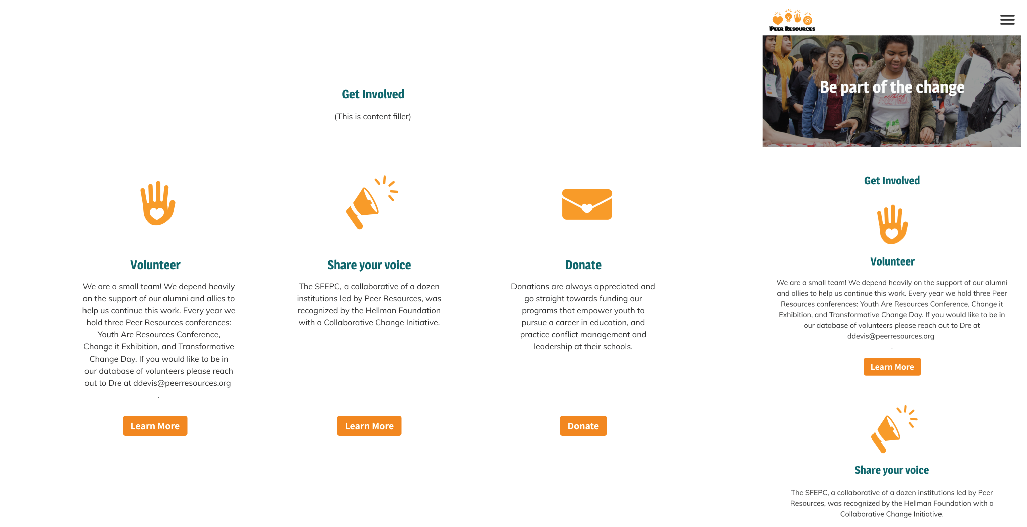
Through user testing, we found that users were confused about how they could support the organization even if they didn’t want to be a full-fledged funder or apply for a program. To resolve this issue we created a get involved page that is broken into three categories with a brief description and a CTA that takes the user to the appropriate page.